The client
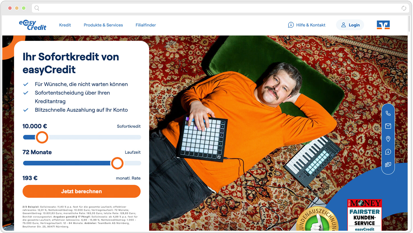
With easyCredit as its main product, TeamBank AG is an expert for liquidity management in the Volksbanken Raiffeisenbanken cooperative financial network. They offer Germany's most recognized online credit for loans up to 100k.
“The design system is the source of truth for our design decisions and guidelines. It is there to ensure a consistent perception of our brand and to sustainably improve the user experience.”
The challenge
When the client approached me regarding a design system documentation effort I already knew this would end up a large project. I was asked to document a design system as a whole from XD to Zeroheight, a design documentation platform from the UK. When I first looked at the design libraries I was stunned by the sheer size of it. All in all it meant breaking down each component and design pattern into small easily digestible chunks that everybody could refer to especially those developers and fellow designers. Half way through the project, the client decided to switch from XD to Figma, which added another dimension to an already ever growing project.
Research & Planning
The client was already quite taken by the idea to use Zeroheight. When looking at their showcase it became evident that other large scale brands such Helly Hansen or Uber had already made use of the software. They do offer great tools to document and explain use cases, anatomies and specs. When studying other design systems out there especially the big ones like Material I quickly understood what needed to be portrayed.
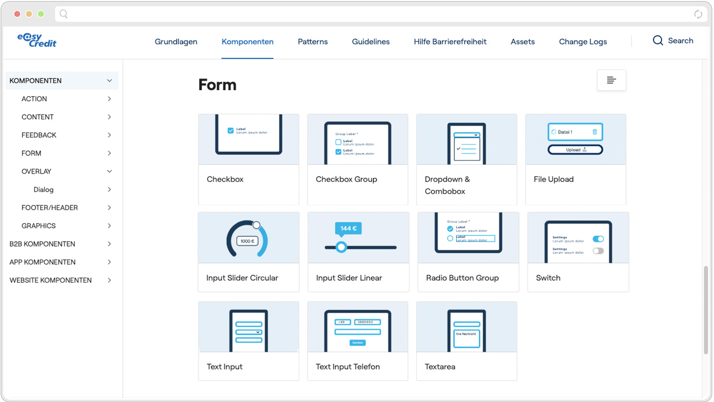
Designing the platform
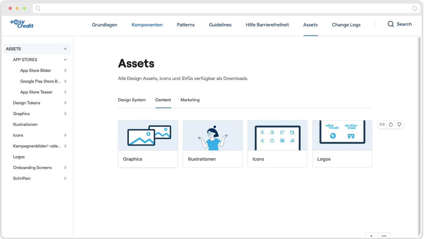
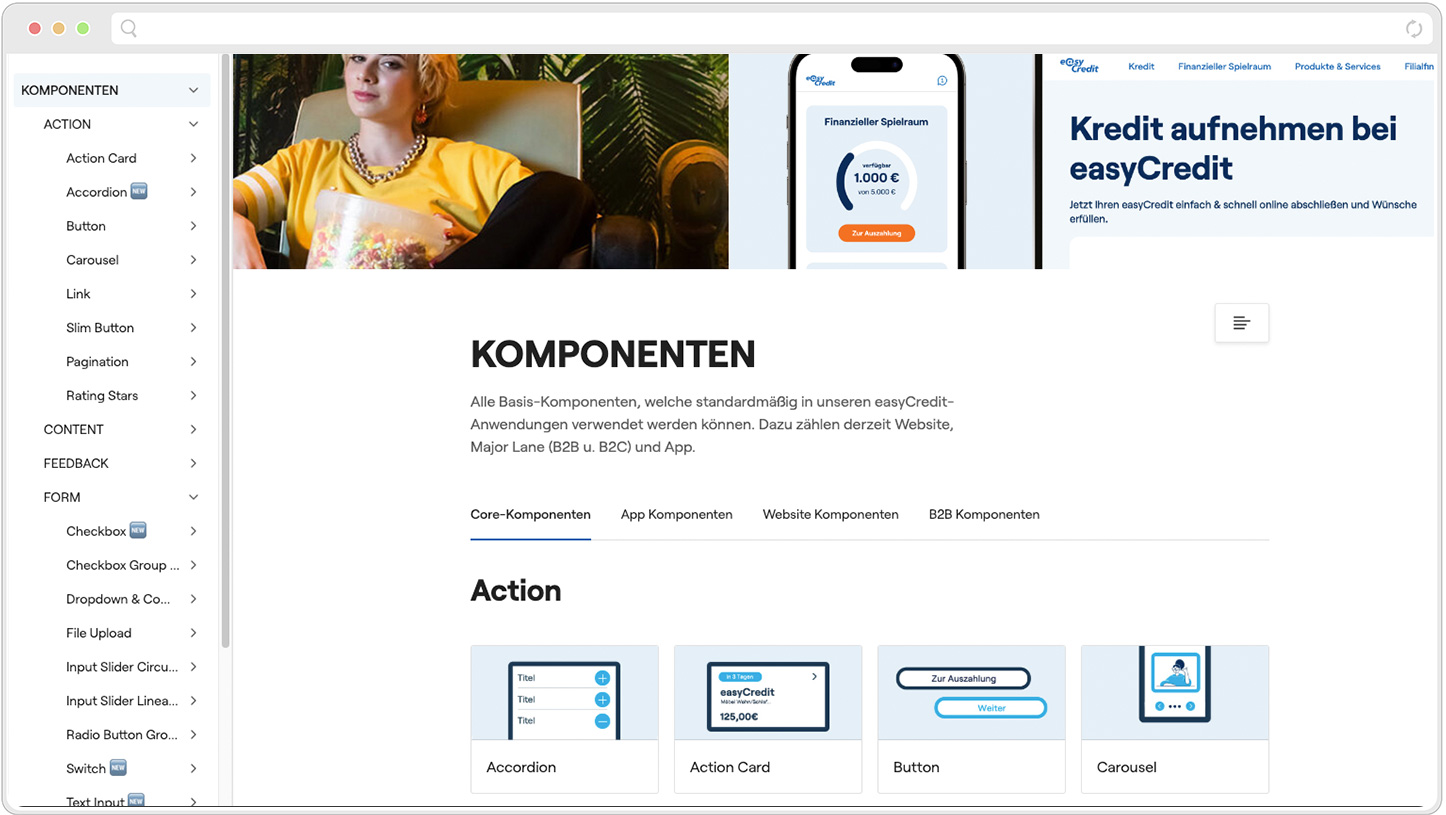
Based on my research and focus groups with the client I knew that I needed to put together a platform that allowed everybody to get the necessary infos to reassure brand alignment across all products. It had to be crystal clear as to what design tokens to use, where to find stuff on Storybook and most importantly the guidelines to the correct use of design system components
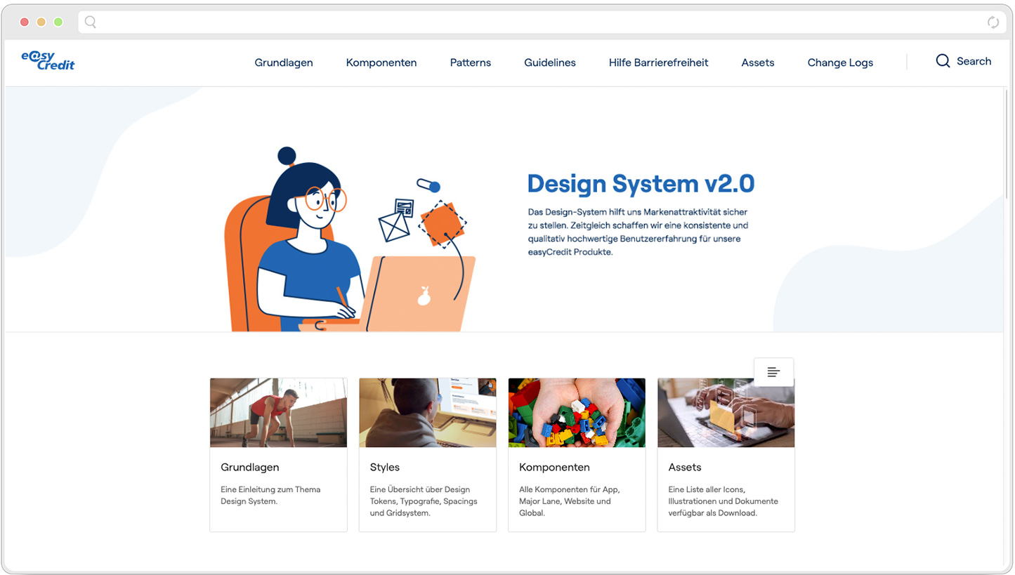
Final Designs
Summary
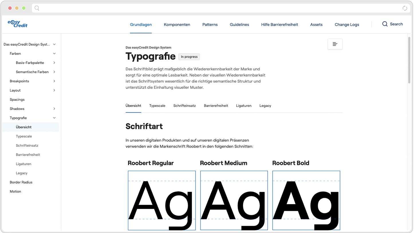
To build a design system in Zeroheight from scratch based on a Figma library was a huge undertaking. After 2 years I counted over 40 components from buttons, accordions to snackbars, which were fully documented let alone the style guide itself including typography, color coordination and layout. It has shown to be a vital part of the company because all devs, designers and stakeholders would use it as a source of truth. The users would continually increase from month to month proving that the system provided real value to all involved. I learnt that while it's good to present and manage components in Figma (Dev mode etc.) it's even better to have a proper Design System/Library, which is accessible to everyone even PO's etc. allowing all contributors to have a single source of truth.