The client
DHCR is a course registry website with the goal of allowing students to find University courses in the Humanities near them. Uniquely focused outside of the classroom, their aim is to become a singular resource enabling students to explore and share their interests with other students, discovering and managing extracurricular activities, and allowing their parents and teachers to communicate non-academic information.
“Users are easily lost when looking for courses, the new design would improve this very likely!”
The challenge
The challenge was to improve the current web search interface und thereby improving the user flow across the website. Through recent survey and user feedback it had become apparent that students often don't find what they were looking for and that the filtering and sorting option weren't clear to use. Another task was to provide the layout for a mobile version of the site especially the search part , which wasn't developed at all.
Research & Planning
The simplest starting point was to survey the target users to learn about the pain points whilst using the site. I needed to find out where students might get stuck or what was preventing them from finding the info they were looking for. Finally, I asked them what they would improve themselves and what aspects frustrated them the most.
Identified problems
Clear trends began to emerge when I collected the survey results. The main issue being the site performs badly on mobile and with certain functions. Filters are often hidden when they are needed most. It became very apparent that students struggled to to find courses matching their search query. A problem, which refers back to the search engine itself not adequately returning course data. In addition through the lack of filters and poor layout choices, users quickly became turned off and left. Here a summary of the main problems encountered:
- Filter options are only visible after clicking the button "Filter", and the button doesn't look very inviting to click on
- No possibility to search/filter on text or tags. This is partiality covered by the search bar.
- Needs to click multiple times and open a separate popup window, which could be confusing.
- Website not working correctly on mobile, unable to select buttons to view courses
- Text cut off on list view
Personas
The data I collected from the research helped me create 2 personas embodying 2 different student types in my target user group.
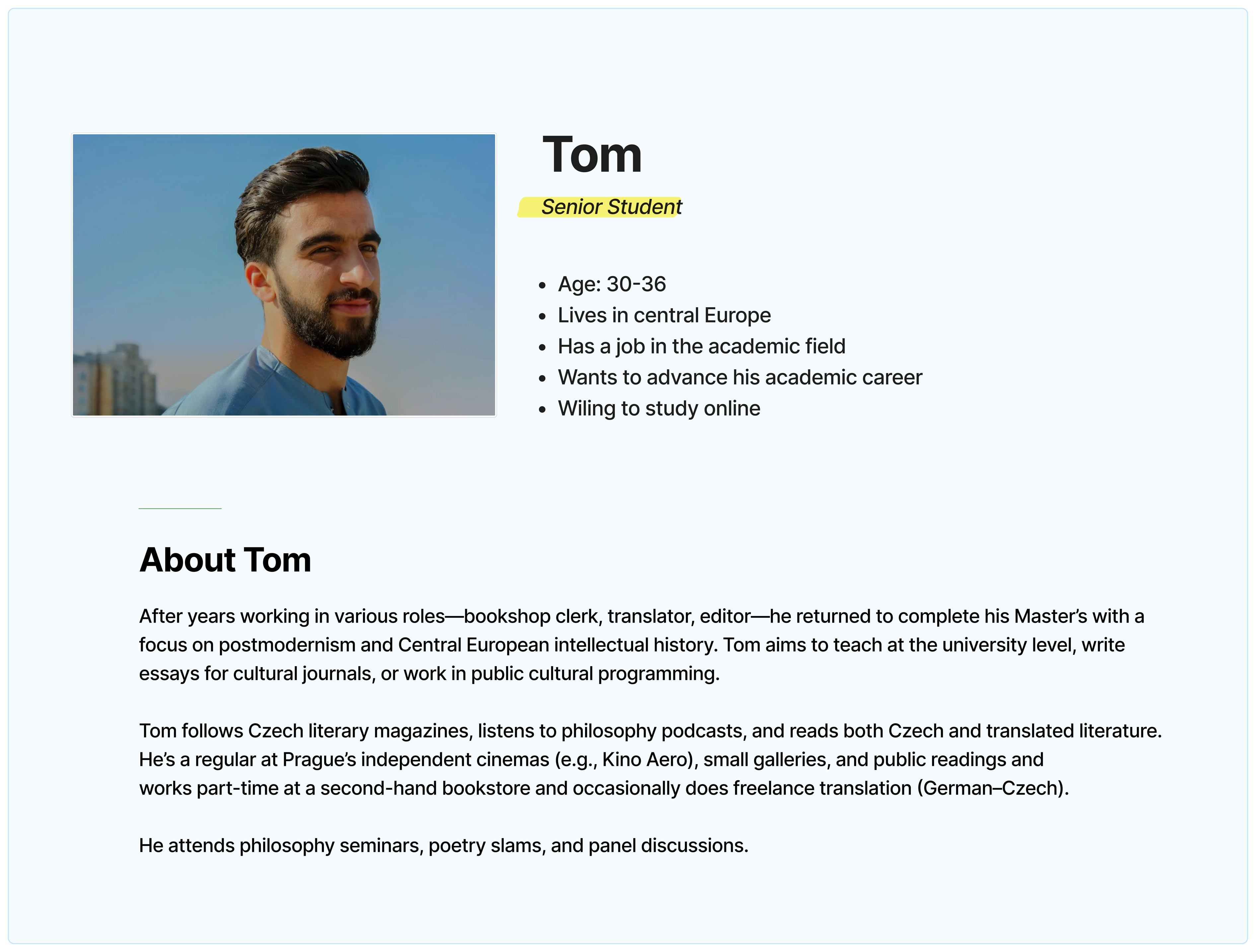
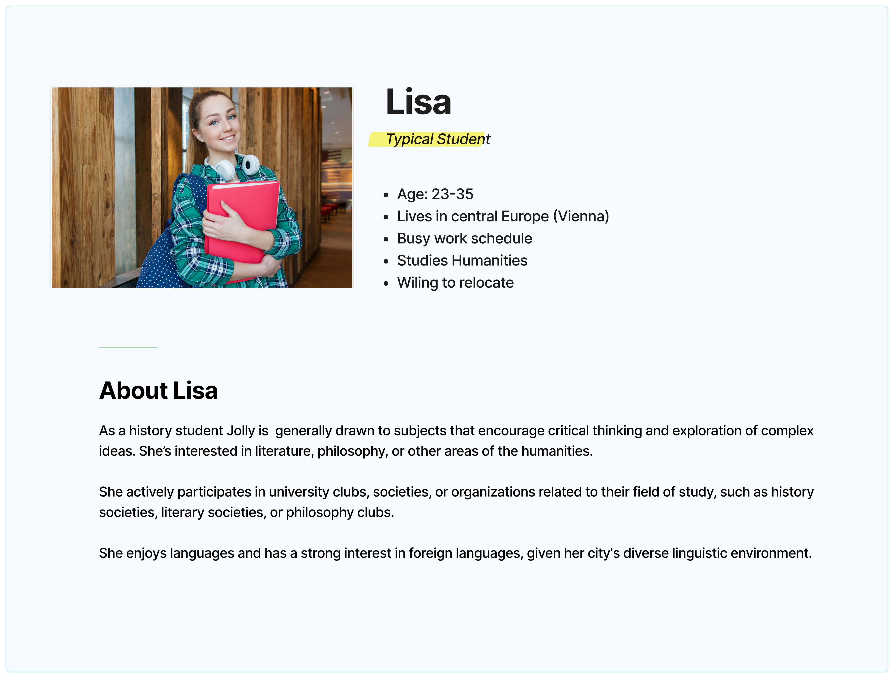
Many of my design decisions were made with Lisa in mind as she represents approx. 60 percent of the target users. Around this point in our design process, the client sent me a list of features that were collected while performing some interviews with in house members and student leaders. I have incorporated those features in the initial designs.
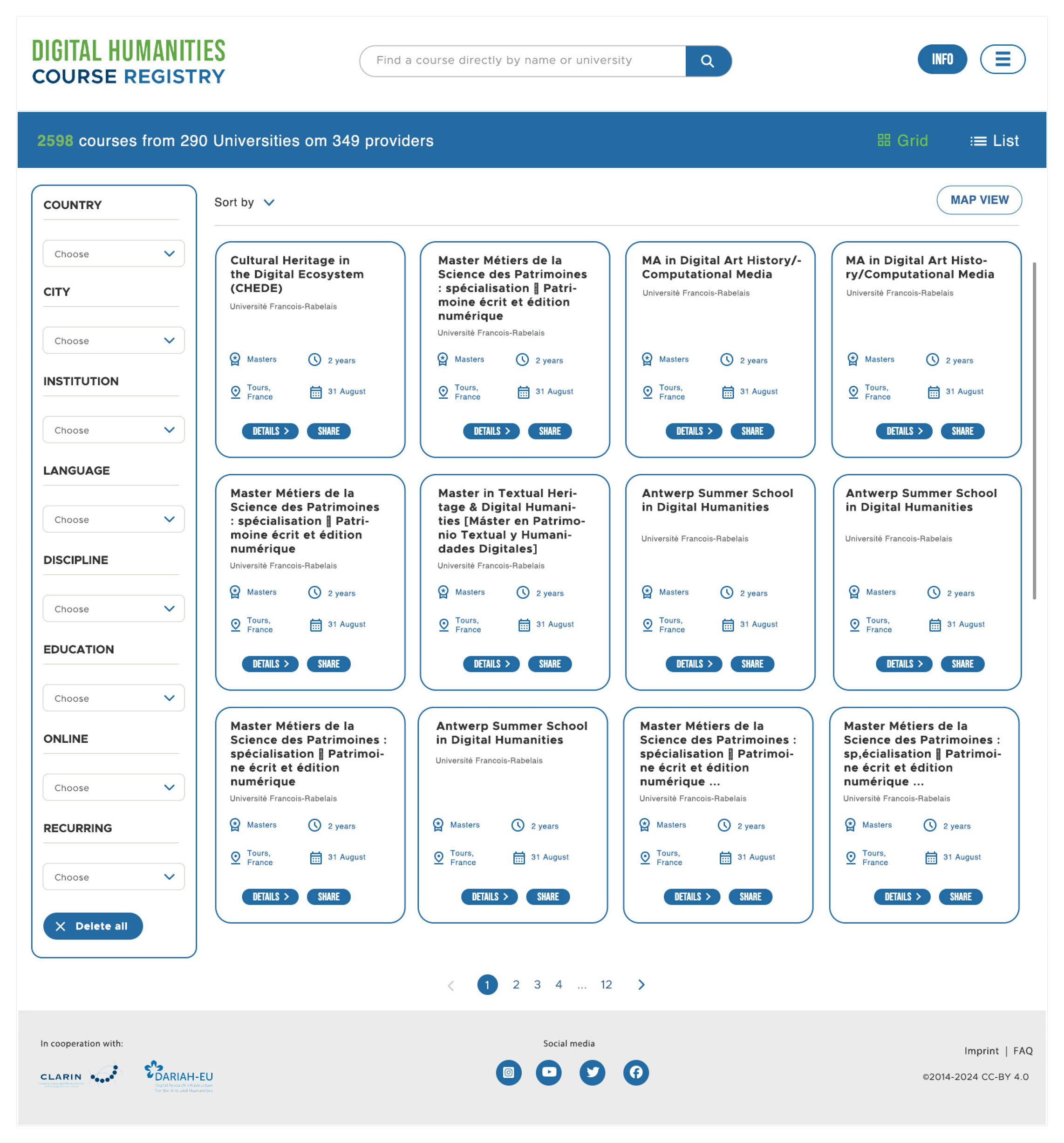
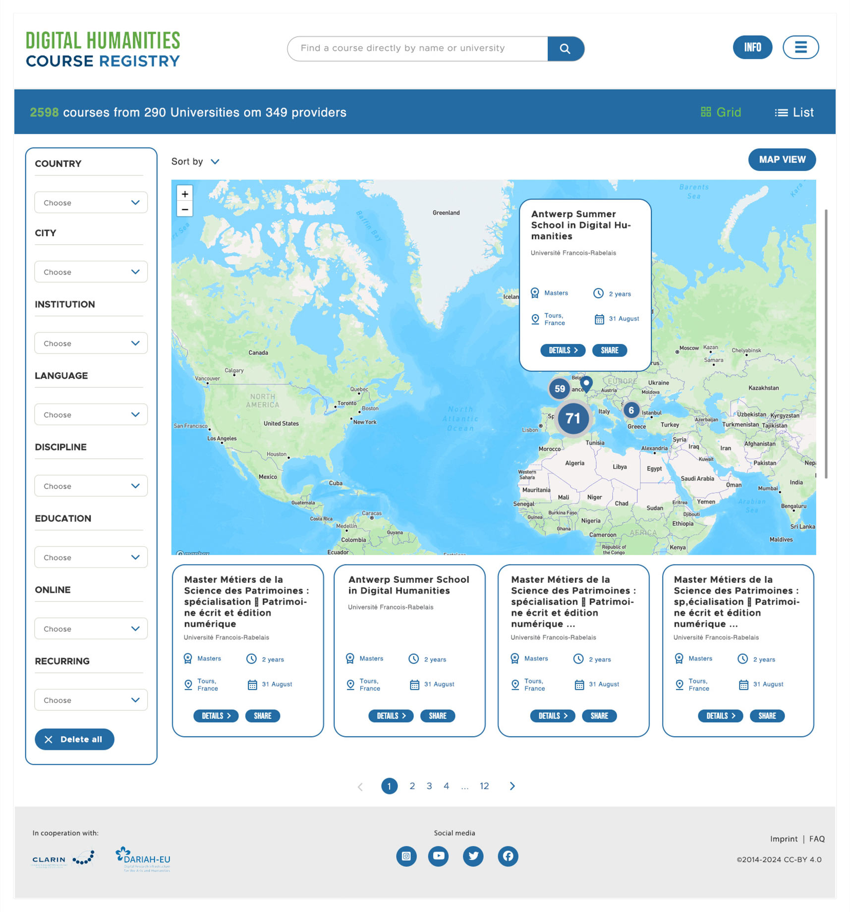
Designing the solution
Based on my research, I figured that I needed to streamline the actual purpose of this website , which is to allow users to find the right course in the desired location. At the same time it was necessary to make sure filters were prominent at all time, the mobile site is on point and that a high level of accessibility is given.
At first I created the mobile version of the site that displays filters around the search. I then created multiple versions of the initial search page on desktop so I could test ideas around the ways students might interact with the courses and the map.
First Wireframes
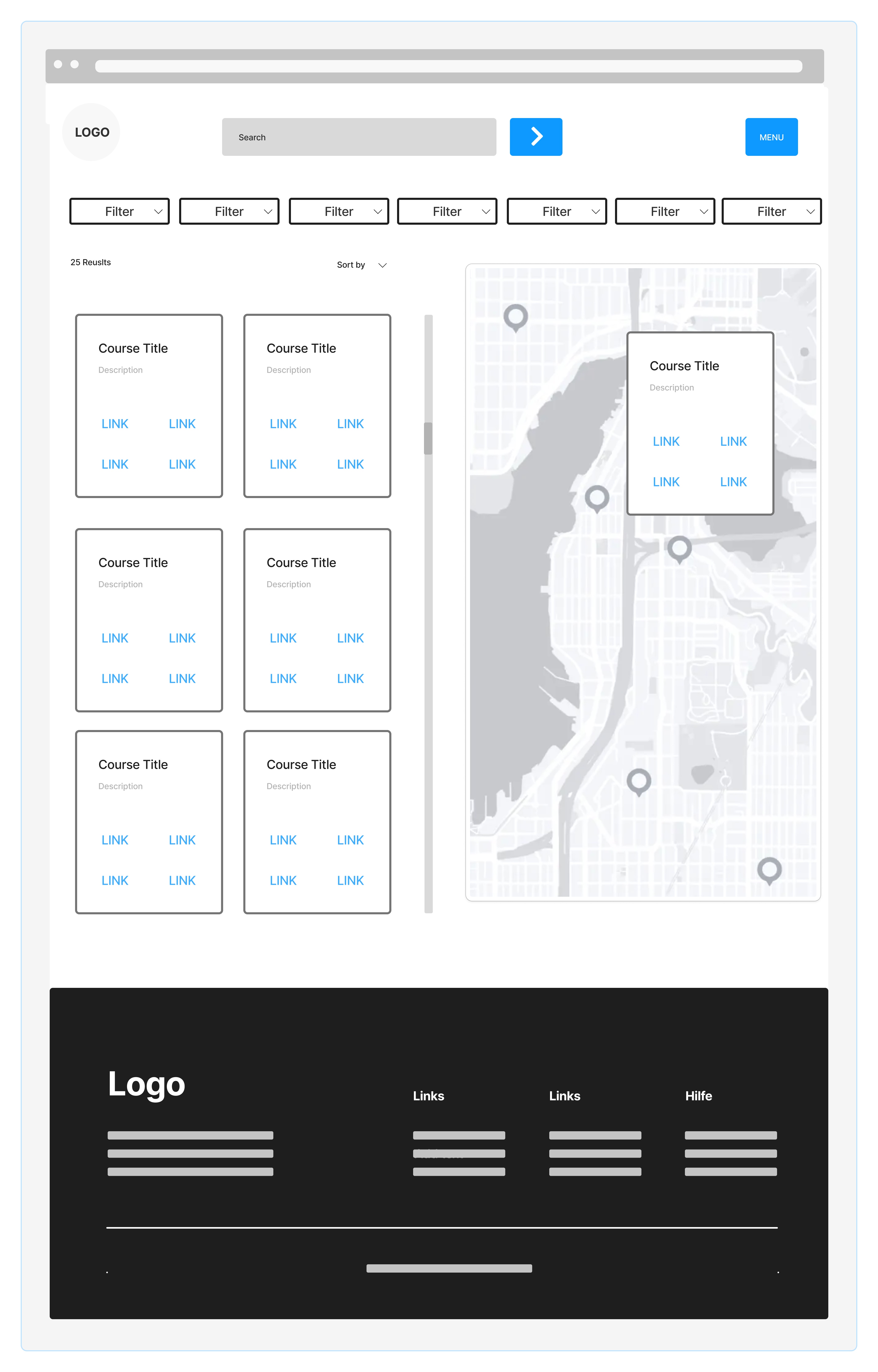
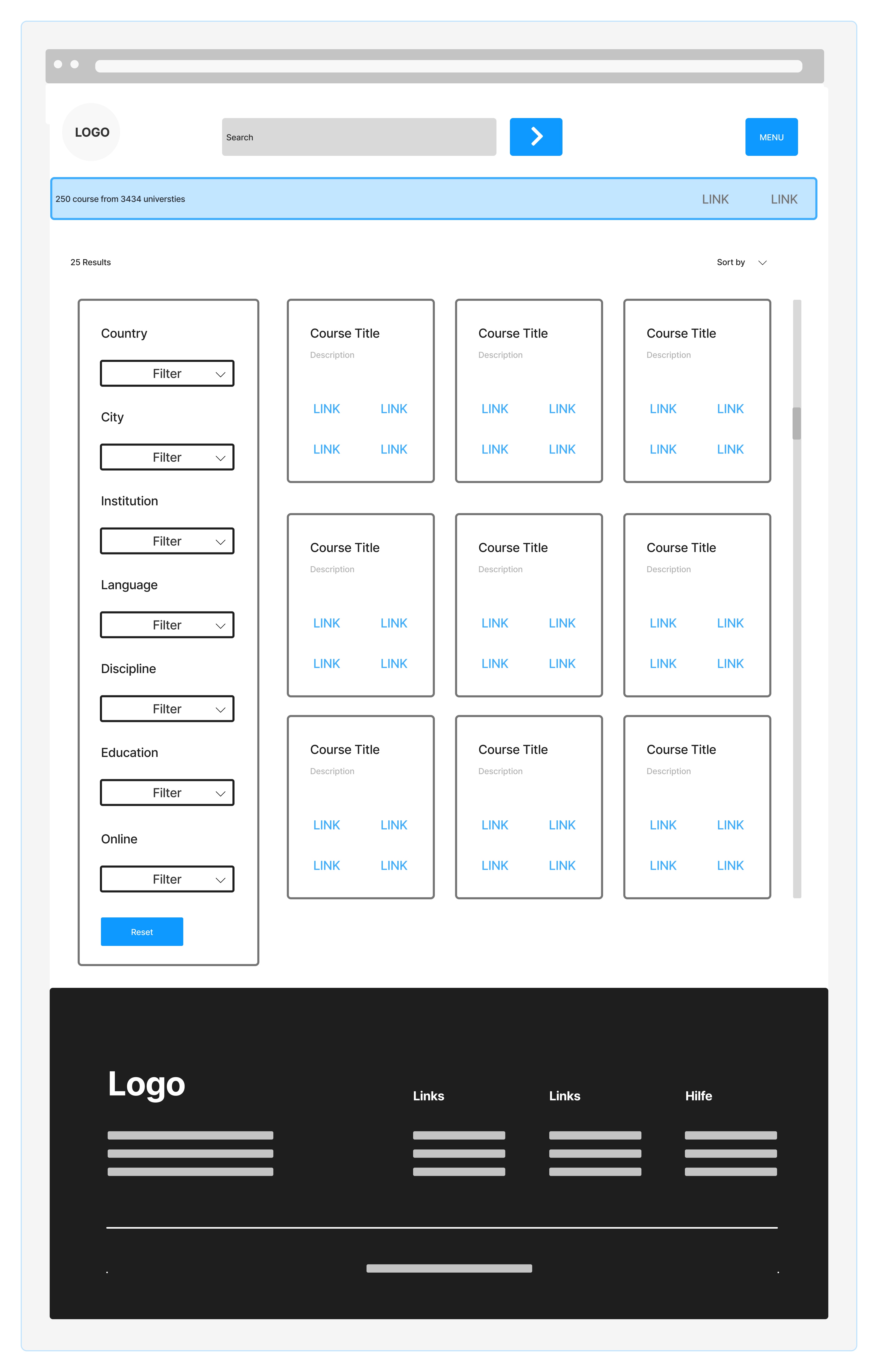
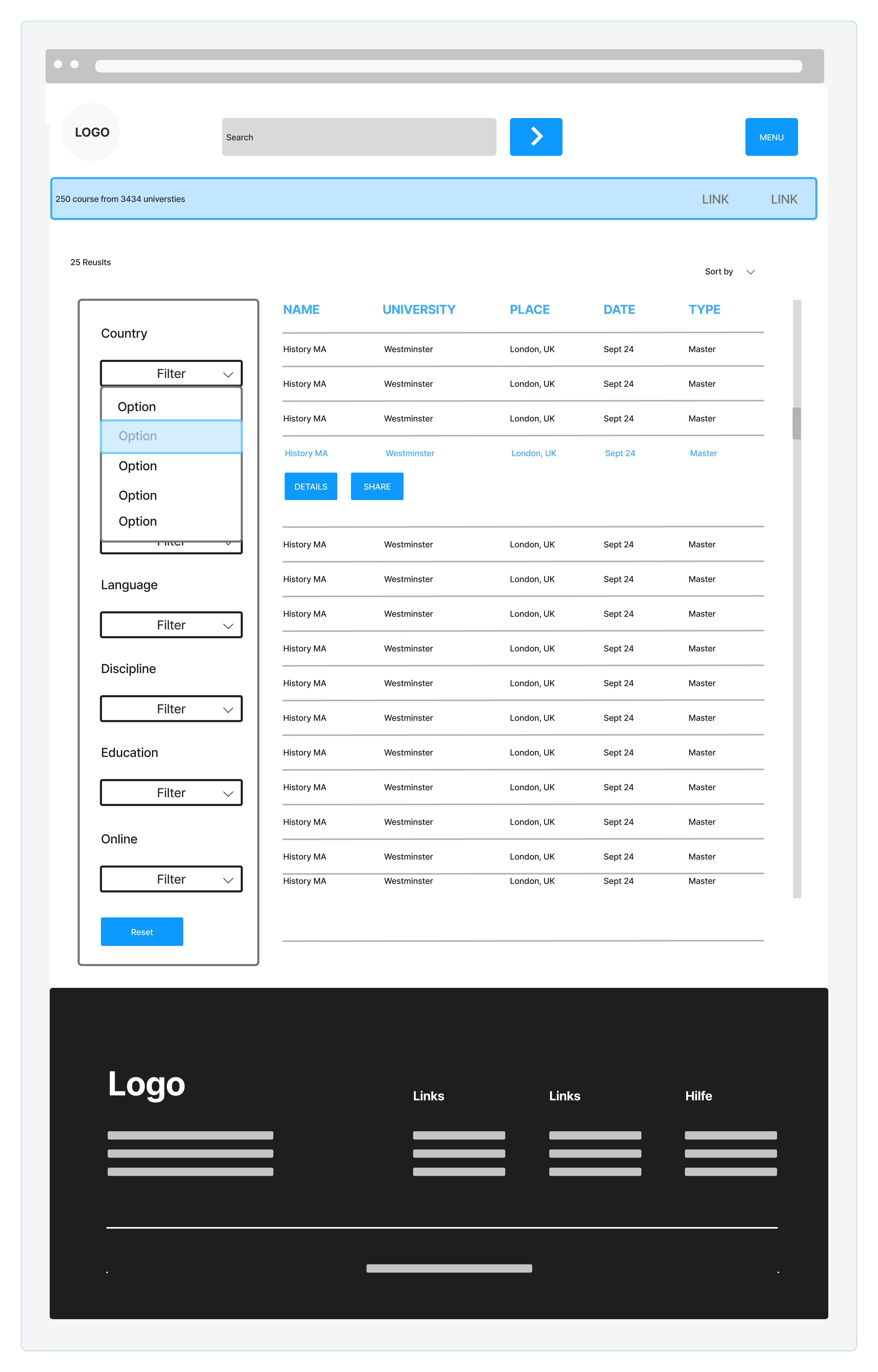
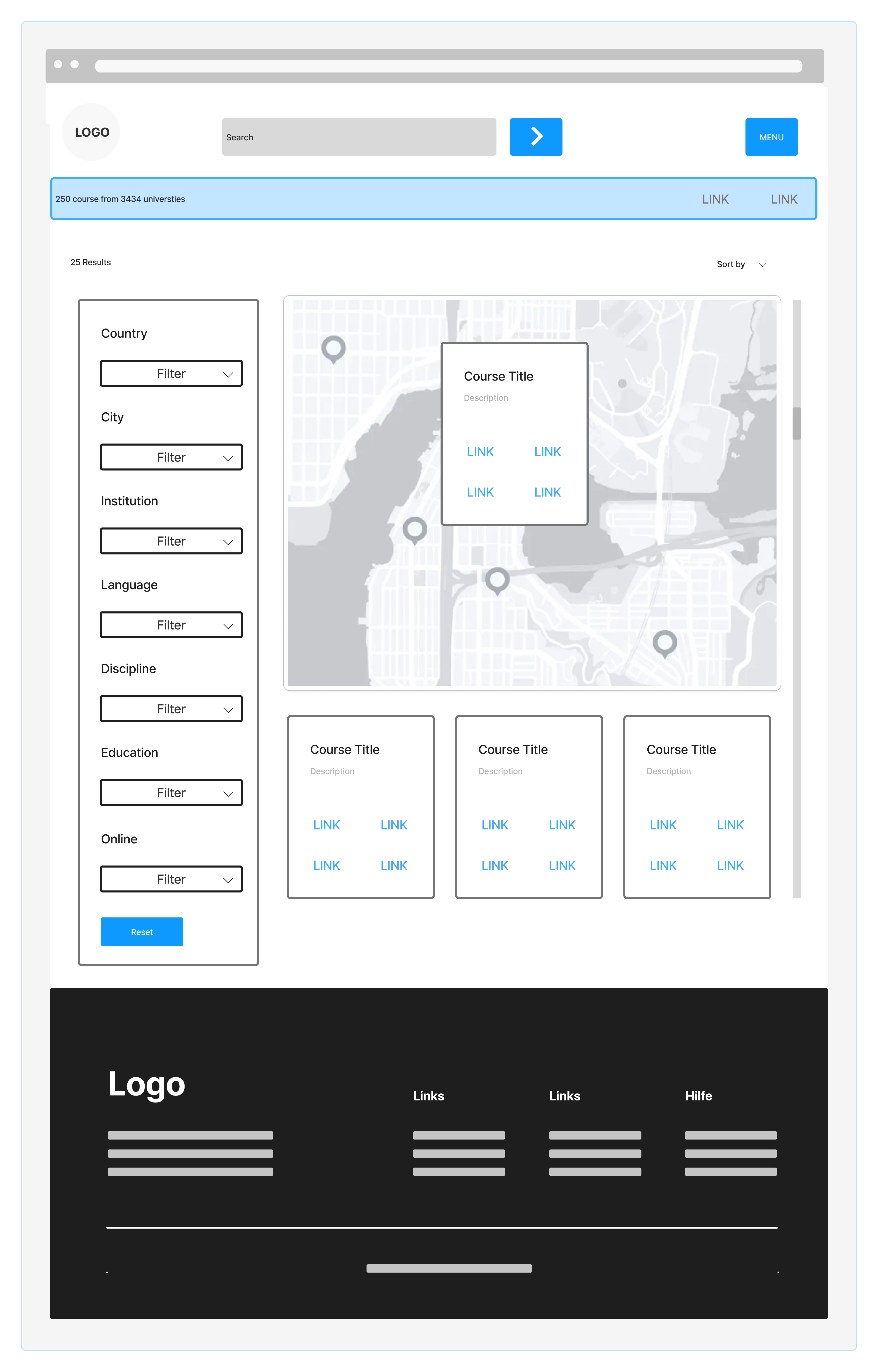
After some user tests and walking the client through the initial wire frames and it became apparent that a layout that favours the filters on the left hand side was the preferred arrangement. My suggestion to place the filters on top for mobile with a sheet that opens up was embraced by both groups so I now had the info I needed to provide some hifi mock-ups.
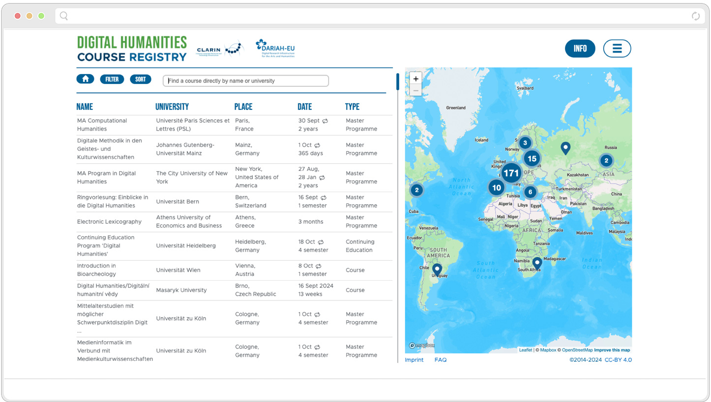
Final Designs

Summary
The scope was relatively small compared to similar projects, which resulted in a quick turn over for the client. I prepared those focus meeting with the stakeholders in a way that was easy for them to understand the UX-Process and the steps involved. Also, I was lucky that my designs and nearly all my suggestions were taken on board, hence there wasn't much back and forth. If I could improve one thing, it would be to pay even closer attention to accessibility, focus orders etc.